


- Home
- »
- Photo Gallery
- »
- Photographer in Gliwice
- »
- Photography articles
- »
- Photography blog
- »
- Publications on photography
Colour is one of the most powerful tools in photography. It determines the emotions a photograph evokes, how the viewer interprets a scene and the mood created by light. Colours can give a photograph energy, calm, drama or nostalgia.
Using colour deliberately allows you to build a story — not only through the subject but also through atmosphere.
When you want to create a photograph full of emotion, closeness and mood.
Warm colours give a photograph a cosy, emotional character. They work very well in portraits, interiors and scenes with atmospheric lighting.
When to use them: portraits, interiors, sunsets, family photography.
When you want calm, minimalism and a stark atmosphere.
Cool colours give photographs elegance and calm. They work very well in landscapes, architecture and minimalist photography.
When to use them: landscapes, architecture, shaded scenes, street photography.
When you want to create a cohesive, elegant and minimalist photograph.
Monochromatic frames are subtle and quiet. They allow you to concentrate on form, light and composition.
When to use it: minimalism, architecture, fine-art photography.
Combining colours allows you to control emotion, direct the viewer’s attention and create a cohesive frame. To do this deliberately, it is worth using the colour wheel — a graphic model showing relationships between colours.
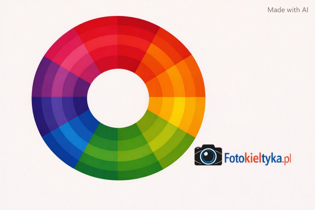
Using colour deliberately allows you to create photographs that not only show a scene but also build its emotional narrative.